Responsive Web Design (And What It Means To You)
Tuesday November 1st, 2011
Responsive web design is gaining popularity among designers and programmers, but non-tech business owners can really benefit from understanding what responsive design is and what it could mean for their business.
Pondering modern design philosophy may not be appealing to the average business owner, but saving money and being efficient certainly should be. It makes sense, then, that the average business owner won’t necessarily hear the buzz about “responsive design.” Responsive design is a web design philosophy that’s rooted in the concept of using one set of efficient code for all devices.
Let Websites be Websites
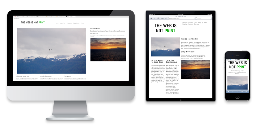
We need to rethink websites and how we design and interact with them. We should stop thinking about them like they’re printed material on paper. Let’s embrace the movement and interaction that modern technology allows us to have with our message. Websites should provide the most optimized, quickest and most enjoyable user experience no matter where they’re viewed. In order to do that, we need to employ the principles of responsive web design.
Responsive web design is design that grows and flows within the browser window. Using only one code base, a website can grow to fit the largest screen or shrink and stack to fit the smallest mobile screen, all with elegance and attention paid to design and usability. The trick is to forget about some of the restraints we currently impose on websites while deciding what is “good” and “pleasing” and “efficient” design, and to embrace some new thinking.
Is this starting to sound too philosophical?
Well, OK. Fine. Instead of talking about the design philosophies behind responsive web design, here are a few reasons why a business can benefit from thinking about the Web in a new way.
Adaptability
The Internet is an open and adaptable medium that can show up anywhere, from computers and phones to TVs to vanity mirrors and car seat headrests. Who knows where the next screen or projection surface will be? Content for such an adaptable medium should be able to adapt. This reduces redundancy in planning, development, and maintenance and therefore decreases cost. One code base can serve any and every device at the same time.
Furthermore, there will always be some new device that people decide to start surfing the Internet on. If your site is responsive, there’s no need to decide if it’s worth the cost to build a version of your site for the new device. It’s already built and displaying beautifully.
Consistent Branding
For a lot of companies, online presence is almost entirely a branding exercise. It’s all about being there when your customer is looking for you. A successful brand is one that customers can identify with, relate to, and ultimately fall in love with. It makes sense that after spending the time to bake that brand into a perfect website, it should always look the same. With a responsive design, that brand will form fit to whatever medium it’s being displayed on. There’s never confusion or guessing for your customer, and there’s only one update each time you need to make a change.
Evolution
In a very short time, all of the smartest and most agile brands will boast responsive websites, and everyone else will be clamoring to catch up. Efficiency and good sense will undoubtedly win out, and when that time comes, instead of trying to keep up, you’ll be miles ahead.
It’s hard to tell companies that they should, without a doubt, look at implementing a responsive website. There are limitations. There are drawbacks.
It’s really easy, however, to tell companies that they’d better open up to a new way of thinking about the Web. They’d better be receptive to some big and beneficial change, and they’d better be ready to implement when the time comes. Those who don’t react will fall behind. It’s a lot like when older companies used to argue the importance of a website in the first place… remember those days!?
This article was originally published in Philly Ad News
Two of my Favorite Responsive Sites Right Now
(Play around with the window size to see how these sites shift and rearrange for different device sizes… or open them up on your phone and your computer at the same time.)
http://anderssonwise.com
http://bostonglobe.com