A Guide to Leverage’s Top jQuery Plugins: Make Images Responsive, Hide Elements With Classes, and Animate Based on the ScrollTop Property
Monday September 9th, 2013
We’ve open-sourced several of Leverage’s top jQuery plugins that help us make our sites more responsive, interactive and easier to create.
As you may or may not know, at Brolik we use a proprietary website framework and CMS for almost all of our projects. It’s called Leverage.
Leverage is proprietary (although that could change in the future… hint, hint), but we’ve open-sourced several of Leverage’s top jQuery plugins that help us make our sites more responsive, interactive and easier to create.
The plugins can be used on any site, whether it’s built on Leverage or not, so I’d like to explain a little bit about each and encourage you to use one or all in your next project.
I won’t get into code examples here, but each of these plugins has documentation online, and of course, feel free to email me at thomasa@brolik.com or tweet me @drewbrolik with any questions.
Let’s get into it.
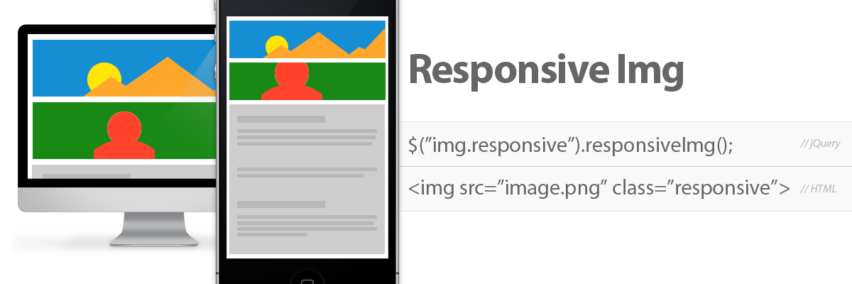
Responsive Img: Make Your Images Responsive Without Creating New Images
Responsive Img provides a dead simple way to improve image performance on responsive websites across all devices, screen sizes and screen resolutions.
Responsive Img is by far Leverage’s most popular plugin. The documentation website gets notable traffic, and we see a lot of positive tweets and write-ups about the plugin.
The beauty of Responsive Img is that you can add it to almost any website, without additional markup and without creating additional assets. The plugin takes care of all the hard work by creating and adjusting images automatically, based on browser size and resolution.
The Backstory
Responsive design is immensely popular, and undeniably important to web design. These days, there are a lot of great people doing great things with responsive web design, but there is still a glaring issue we all face: responsive images.
While there are some great solutions out there, most of them require you to implement new and “non-standard” markup in your code and to create additional images for different screen sizes and resolutions.
In practice, there’s more to responsive images than serving up smaller, faster loading images for smaller screens. There’s also the issue of art direction. Basically, sometimes you might want to crop in on an image when there is less screen real estate, as opposed to just shrinking it.
Furthermore, Retina Displays and other displays with higher pixel density require a larger image (pixel-wise) that gets sized down (physical size-wise) with code.
Recently, there was big news on this front. Srcset was officially added to the webkit spec, meaning that the first major step towards unified, standardized responsive image support is underway. It’s a big step, but it doesn’t solve all of the important responsive issues yet. More importantly, though, it’s only supported by modern webkit browsers.
How Responsive Img Can Help
With Responsive Img, developers and designers can create a single, universal image at a large size or create several versions of an image for different screen sizes. Either way, with one line of jQuery, the plugin takes care of the rest, swapping out images as the page loads or the browser is resized.
In addition, Responsive Img will take screen resolution (read Retina Display) into account when deciding what size images to use or create.
That’s right, create. Using PHP, if an image doesn’t exist at a certain size, Responsive Img will create that image, on the fly, and serve up the newly optimized image instead. After it’s created and stored on the server once, the plugin will switch to that image instead of creating a new one next time.
This is where Responsive Img is different from anything out there, and this is what really saves us and our clients time.
This setup is great for content management systems where the website’s images get updated by a non-designer/non-developer. Users can upload a single image, as large as they have it, and the website takes care of all the rest on the front end.
Not only is it great for a CMS, but it’s also flexible enough for users who are designers. If a designer uploads two different versions of an image, Responsive Img will use the second version instead of creating a new version of the original image. This means we can art direct and be responsive!
The Final Word
It’s immensely important to have responsive images. Load time, especially on mobile phones over data networks, can make or break a website.
Responsive Img gives you all the functionality and intelligence required for handling responsive images, without the need to change pre existing code or code habits. (And that means it’s very backwards-compatible.)

Over Under: Hide and Show Elements With Only Class Name (no CSS)
github.com/drewbrolik/Over-Under
Over Under lets you hide or show elements based on class names that contain media query breakpoint values.
It saves you the time of adding a class or an id to an element, adding some styling to CSS and then overwriting that style with a media query for a certain screen size.
This plugin is fairly new to Leverage, but it’s all over our code now. Where Responsive Img is a whole new way to tackle a large problem, Over Under is more of a time-saving shortcut that speeds up production and prototyping.
The Backstory
It’s a convenient and common responsive design tactic to hide and show elements at different screen sizes. In fact, it’s necessary in good responsive design.
In practice, though, it’s fairly inconvenient to add a separate media query into the stylesheet for every single element that you want to hide or show. This is especially true if, like us, you create media query breakpoints at more sizes than the standard “mobile” and “tablet” sizes.
How Over Under Works
Over Under allows a developer to hide and show elements based on specific class names that contain a media query breakpoint size. So, adding a class of “over300” to an element means that the element will automatically hide when the browser width is under 300 pixels wide.
Behind the scenes, Over Under actually creates a separate stylesheet containing media queries for all of the “overX” and “underX” classes in the DOM, so it’s lightning fast and unaffected by subsequent javascript changes or styling.
The Final Word
Over Under is quick and dirty, but it is effective and immensely time saving. Period.
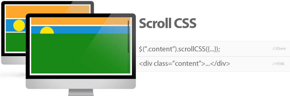
Scroll CSS: ScrollTop-based jQuery Animations
github.com/drewbrolik/Scroll-CSS
Scroll CSS animates elements based on javascript’s scrollTop value. This means that you can have an element fade in, slide out or create a parallax effect by sliding over another element.
All of the animations coincide with the user’s scroll position, so animation is extremely “reactive” and works both forwards and backwards, as the user scrolls down a page and then back up.
The Backstory
Interactivity is huge right now. So is user experience and showing the user only what they need right when they need it. For that matter, parallax scrolling effects are also huge right now. This makes sense. As browser and processor technology get better, so does website interaction and user expectation.
We developers need to stay current and create the best experiences we can, but we also need to manage time and budgets.
What Scroll CSS Does
Scroll CSS allows you as a developer to quickly create interesting and responsive interaction, without being a jQuery expert. Call the plugin on an element, and specify which CSS property to animate, the CSS start value, the stop value and the scroll values (by pixel or anchor tag) to begin and end the animation. The plugin takes care of the rest.
With this technique, it’s easy to slide a “contact us” button into view when the user scrolls to the end of a section. It’s also easy to slide one section of content up over another (a very popular jQuery parallax effect). The best part is, when the user stops scrolling mid-animation, the animation stops as well. If they scroll back up, the animation runs in reverse.
The Final Word
Websites and web-based applications are getting more complex as developers and technology become more advanced. As animation and movement become the standard, you need an easy way to implement little “bells and whistles” without killing the budget.
Scroll CSS is the way.
Until Next Time…
I hope some of these piqued your interest. We love to share what we can, and since these tools help us on a daily basis, it’s only fair to give back and share them with the community.
As we create more jQuery plugins, we’d love to share more as well. If you’re interested in creating some of your own, see Kyle Jasso’s jQuery plugin tutorial in the Brolik Blog.
Until next time, keep improving the web, and so will we.