Above the fold– the holy grail of web design real estate. It is the portion of the website that is viewable without any further action. But in this modern age, the concept of the fold is difficult to pin down. Where is the fold? And how important is it?
Background
Back in the glory days of newspapers, the fold played a crucial role in grabbing the attention of viewers in order to encourage them to purchase the paper. Bold headlines and eye catching images bombarded readers to pique their interest. This concept transitioned into web design, where designers make sure to place important information and imagery above the fold.
The debate of what belongs above the fold and what belongs below the fold lives strong in the current world of web design. Clients question the location of the fold. Designers cringe at the mention of the concept. As a web designer, it is important to give the fold the respect it deserves while also acknowledging its diminishing importance.
Where is the fold?
With the rise of mobile and tablet devices and the continued increase in desktop screen sizes, the fold has become increasingly inconsistent. Web designers simply cannot rely on a general rule of the location of the fold, as it can vary widely from user to use case.
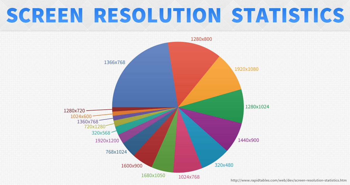
As you can see from the above graph, there is a wide discrepancy in screen resolutions. The vast majority of screen heights are in the 768-1080px range, while phones and tablets differ even more. The location of the fold is dependent on a wide variety of variables including screen size, screen resolution, browser size, and responsive design techniques, among many other factors. Therefore, it is impossible to pin down the location of the fold and it is important to focus on the rules of good usability rather than on a strict guide of where the fold is.
Focus on Usability
Paying attention to the fold as a web designer is about making the website as usable as possible. The portion of the website that is above the fold is still the most valuable real estate on a website and the user experience should reflect that. Jakob Nielsen estimates that, “...web users spend 80% of their time looking at information above the page fold. Although users do scroll, they allocate only 20% of their attention below the fold.”
Put Important Information Above the Fold
Important brand imagery and messaging, site navigation, any important call to actions, and an intro or preview of the information on the page should be above the fold. But, it is crucial to have a good balance between this concept and the basics of good usability. Do not try to jam every piece of content above the fold. Group your pieces of content together into manageable chunks and spread them out with proper hierarchy and whitespace to promote easy skimming and scanning. (Read 10 more tips for usability.)
Tell Them a Story
The information at the top of the page should be a preview of the rest of the page. Allowing your users to easily anticipate the content will encourage them to scroll down the page and continue reading. It's 2013, your users know how to scroll. Devices are configured to make scrolling easier than ever and users expect to scroll on the web.
You want your users to want to explore the rest of your site. If you focus on telling them a story or piquing their interests, rather than shoving as much content down their throats as quickly as possible, you’ll find that they want to stick around and explore life below the fold.
In Conclusion
While the fold will never disappear as a concept, it is a rule that can be bent. With so many different devices and resolutions, the fold differs far too much from user to user to be relied upon regularly. By making sure to place only the most important elements above the fold, you can find a better balance between usability and the fold. In web design content is king, and by putting your focus on usability, you are giving the content its rightful throne.