“Give me six hours to chop down a tree and I will spend the first four sharpening the axe.” - Abraham Lincoln
If your e-commerce platform is not responsive, then it is essentially a dull axe! Before picking up the axe, listen to ole’ Abe’s sparkling bon mot and note the importance of what it speaks to: preparedness. A responsive e-commerce platform is more than just good, efficient design. It is critical in preparing your business to accommodate your customer’s behavior, on their terms. Even more so, a responsive website will perform wonders when it comes to streamlining your content management process; and this means improving your bottom line.
Dear CMO
If you are unfamiliar with responsive design, a short definition is that it is one website which provides a unified experience across all screen sizes and devices. For further reading I would suggest a previous post from The Brolik Blog written by our Chief Creative Officer, Drew Thomas, endearingly entitled “Responsive Design (And What It Means To You)”. If your e-commerce platform is not responsive, you are doing your company a great injustice.
A Numbers Game
Marketing can be considered in many ways as one’s ability to place a wager on a set of numbers. Marketers leverage the best possible data at hand before hedging their bets in pursuit of reward. Here are some numbers where I am willing to place my bet.
According to the Walker Sands 2013 Second Quarter Report approximately a quarter of all US Internet traffic is generated from mobile and tablet devices. This represents a 78 percent increase from Q1 of 2012. During holiday seasons, US mobile e-commerce traffic has reportedly soared as high as 33 percent (BrandingBrand and ComScore via TechCrunch).
Globally, mobile and tablet devices account for just under 18 percent of all Internet users, as reported by Internet data giants Statista. A white paper forecasting global mobile data trends starting in 2012 through 2017, furnished by Cisco Systems, shows global mobile Internet usage has increased today by 70 percent since 2012.
The numbers tell a story. How meaningful this story is to your business is up to you. At Brolik, we find the majority of e-commerce clients we engage with report 20 to 30 percent of their web traffic being dominated by mobile and tablet users. I would go as far as to say that if you consider your mobile traffic a minority and non issue today, you are being extremely nearsighted about how your business is prepared to address your customers moving forward. Transitioning to a responsive e-commerce platform is the first step in sharpening that axe.
As an aside or additional food for thought, Nielson Media analyst Nicole Hall, by way of The 60 Second Marketer, drills global mobile phone penetration down to a simple, relatable datapoint. There are 6.8 billion people on the planet. Four billion of us use mobile phones. Three billion of us use a toothbrush. Yes, choose to believe it or not, but more of us tittle-tattle away on our mobile phones than brush our teeth. Gross? I will refrain from passing judgement. Astonishing? Without a question!
The Complete Shopping Experience
If the numbers are not enough to move you, I urge you to consider the impact responsive design can generate across your entire e-commerce platform. Today, your customers are likely used to a well engineered shopping experience designed for the desktop shopper. Your site may be loaded with bold visuals, videos, a thoughtful blog and even strong customer reviews. All of it is at a disadvantage if it is not universally accessible.
Sterling Jewelers (dba Kay Jewelers) and Zale Corporation (Zales) are two large, national fine jewelry brands. Neither company utilizes a responsive e-commerce platform. Kay Jewelers provides a separate mobile experience for its customers, while Zales has made absolutely zero effort to accommodate a mobile audience. We can start with the obvious dud.

Exhibit A: Zales desktop site with no added mobile considerations
The Zales mobile experience is absolutely agonizing. There is no clear content hierarchy. You have to hold the screen up to your nose to try and make out the tabs across the menu bar. Within your first pinch or tap, you are zoomed in so close that it is impossible not to lose your bearings. That is it. I am done. Bye bye! If anyone reading this blog is able to make an introduction to Richard Lennox, Zale Corporation’s CMO, I would appreciate it. I am here to help!

Exhibit B: Kay Jewelers desktop site and the Kay mobile site
The Kay Jewelers mobile site is a step in the right direction, but still leaves plenty to be desired. Mobile sites are the ugly stepchild of their desktop parents. A good amount of their parent’s DNA is there, but the mobile site often shows its DNA deficiencies. In this example with Kay Jewelers, their homepage includes a store locator icon on the top right hand corner. The mobile site does not. What if I am a customer that, entering the Kay website via mobile, have my eyes set on a product but would prefer to shop in person? In this case, I am left without the ability to find the nearest location.
It is not the lack of responsive design, but the lack of a well thought out mobile strategy, that played the culprit here. Designing for mobile can be tedious. Developers have to rethink a website’s anatomy to determine which menu items and calls to actions should take precedence on a mobile version of a website. Often developers have to work off assumptions of what navigation items should be kept or sacrificed.
Despite this being a mobile strategy problem, addressing this strategy with responsive design does present an advantage. Responsive design is a good way to future proof page elements. One site equals one administrative update to make one change across all devices. This eliminates a lot of the thinking, as well as the double work, in maintaining design. Essentially, getting it right the first time and streamlining the process with responsive will help in preventing crucial page elements from becoming lost in translation during content changes.
I will happily lean on Drew Thomas for the second time today. His blogpost challenging "Responsive Web Design or a Mobile Website" is an excellent compare and contrast for any of you craving a stronger opinion.
Efficiency and Functionality That Goes Beyond the Customer
Perhaps your e-commerce platform utilizes a separate mobile experience. We just discovered how doubling up your efforts to deliver a site across two or more devices can easily muck up your content, punching holes into your user experience. But what about doubling up your efforts internally?
It is all too easy to lose sight of the cost implications that come with maintaining two or more customer experiences. Every time your department funnels a new product or promotion down the line, your admin and technology departments are making those changes to each platform you maintain. Not only are separate sites the pricier option, they are simply put, usually clumsy and inefficient.
With a responsive site, your admin has one site to maintain. One change in code deploys everywhere, keeping your products, promotions and calls to action in synchronous harmony across all devices. Even better, a responsive website saves money over time by taking less resources and manpower to maintain. Why would you not want that?
Having been a CMO, I understand the delicate dance in balancing customer expectations with cost. Investing in responsive design is the best bang for your buck. You can immediately consolidate your development silos, improve your internal workflow and as Lennon and McCartney once sang, “It won’t be long,” until you begin noticing improvements to your bottom line.
For Google’s Sake!
The gods at Google have spoken. They prefer responsive design websites over mobile optimized sites. It is in your SEO’s best interest to follow Google’s command. Leverage Digital Media’s CEO, Jay Taylor, does a good job putting Google’s responsive design preference into layman's terms in this Search Engine Watch op-ed.
The key takeaway is that a responsive site, because it is one site and because of its URL structure, is rightfully viewed as one website displayed across multiple devices by Google. Mobile websites, despite similar content, contain URLs separate of their desktop parents. This impacts how Google treats, classifies and ranks them, viewing each site as an unrelated experience. In short, this impacts SEO and not complying with Google is seen as a negative.
Develop Wisely
If your current developer or in-house team is not experienced with responsive design, you should seek help from the experts. In your quest to find the right team, consider that responsive design is a design philosophy and not a technology. If George Orwell could tell us about responsive design, I imagine that he would say: “All responsive design developers are equal, but some responsive design developers are more equal than others.”
To illustrate the Orwellian point of view, as well as stick with the theme of picking on jewelers, let us compare Anne Sportun Fine Jewellery to Yen Jewellery. Both are examples of good responsive design work, however subtle nuances in design philosophy make the Yen Jewellery site a superior product.

Exhibit C: Yen Jewellery responsive site
It is hard to find much, if anything, I dislike about the Yen Jewellery site. The content displays intuitively across all devices, the layout is crisp and although you cannot tell from the screenshots, all the elements load quickly. Navigation is a breeze. Everything feels consistent. The site was built by WeMakeWebsites and their team did a bang-up job here. I send my kudos to the competition. Moving on.
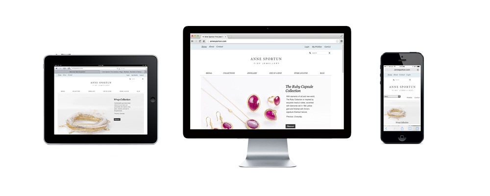
Exhibit D: Anne Sportun responsive site
The Anne Sportun website fits nicely across all three devices, however the mobile version implements a form field drop down menu which is inconsistent with the desktop and tablet formats. Despite this being a widely accepted responsive design practice, responsive design has evolved quickly enough to allow for better design implementation. I am hoping the decision to use a form drop down menu was validated by some sort of usability test. Whatever the driver behind the decision, it is not the best use of responsive design in my opinion.
The Anne Sportun website was designed by Evoke Solutions. I noticed right off the bat that Evoke’s own website is not responsive. Perhaps this is irrelevant, however this would have brought me to a sense of caution if I had been the folks at Anne Sportun. Rule number one: when choosing a responsive design firm, the firm’s own website should be responsive. This is very important. It demonstrates how a firm takes on the initiative for themselves first, puts time into honing the skill and shows that they have assessed their capability before offering it as a service. They offer you the Kool-Aid because they drink it too. They practice what they preach.
All Aboard
Are you a believer in responsive design yet? Do the benefits to your customers and your bottom line have you aching to make the jump? Before you dive in, remember that responsive design is a design philosophy and not a technology. If your internal team lacks the tools, partner wisely with a firm that demonstrates experience, understanding and competence. Again, some responsive design developers are more equal than others.