
Flexbox is a layout model that allows elements to align and distribute space within a container. Using flexible widths and heights, elements can be aligned to fill a space or distribute space between elements, which makes it a great tool to use for responsive design systems.
Flexbox has been around since 2009, and it’s beginning to be widely supported by all modern browsers. If you look at Flexbox on Can I Use? you’ll see that it has great support across the board.
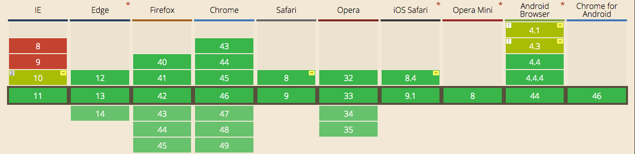
There are some problems in IE8 and IE9, but that’s to be expected. At Brolik, we implement a fallback system using a Sass style sheet and a javascript file to account for these older browsers.
We also use the Compass @include function to get specific browser prefixes, which you can find in this Sass style sheet. The line at the top “$flexbox-support-threshold: -3;” is to support the last three versions of flexbox, which is great for backward compatibility.
Obviously, feel free to use these three files on your own websites. Note, that we use Compass to compile our Sass.
When not to use flexbox
Before I talk about how useful flexbox is, I want to touch on when flexbox overcomplicates things.
Don’t use flexbox for page layout. A basic grid system using percentages, max-widths, and media queries is a much safer approach for creating responsive page layouts. Optimally you’d use a grid system in conjunction with flexbox to achieve the most responsive website. Furthermore, because the flexbox layout is dependent upon content, issues can arise as the page loads. Jake Archibald has a good blog explaining why it’s a bad idea to use flexbox for overall page layout.
Don’t add display:flex; to every single container div. Ask yourself if flexbox really solves an alignment, scale, or ordering issue that can’t be solved in a simpler way with basic CSS.
Don’t use flexbox if you have a lot of traffic from IE8 and IE9. While there are fallbacks (linked above), the experience won’t look the same.
When to use flexbox
Personally, I like to use flexbox for a few main things: scaling, vertically and horizontally aligning, and re-ordering elements within a container. These are best used on page components within a parent element. There are plenty of other uses for flexbox, like changing the direction of a column or row. But honestly, I prefer to use media-queries and percentage-based widths for creating columns and rows. Below, we’ll examine scaling, aligning, ordering, and wrapping with some flexbox CSS tips and CodePen examples.
Scaling
Flexbox
is inherently good at dynamically scaling elements. I was very excited
the first time I put display:flex; on a parent element and saw the child
elements form a nice orderly queue with matching heights.
Matching heights vertically used to be somewhat difficult and would require jQuery after the page loaded. Now flexbox handles the vertical height and floats by default. It’s one of my favorite features of flexbox because I love orderly grids. The align-items property in flexbox defaults to “stretch,” which leads me into my favorite feature of flexbox.
Vertical alignment
You can vertically align all child elements with the align-items
property on the parent container by setting it to flex-start, flex-end,
center, baseline, or stretch (the default). Alternatively, you can align
individual child elements with the property align-self. Below you’ll
see these properties illustrated. I left stretch out because it is what
naturally happens in the first example.
Horizontal alignment
Furthermore,
you can horizontally align items by setting the justify-content
property to either flex-start, flex-end, center, space-between, or
space-around. I like to use it for creating responsive menus that start
at desktop sizes.
The space-between property is particularly useful when you want to craft a responsive menu that fills the entire width of a desktop browser, like we did with the Christina Seix Academy website.
Ordering
Generally, I think that website hierarchy should naturally fall in the logical left to right and top to bottom order. With that being said, there are some instances when that doesn’t work within a design system, and therefore ordering is a really useful tool for responsive design.
For example, I like to use the zig-zag layout
on content blocks that contain an image and some copy. It’s good for
encouraging a user to scroll down the page and quickly skim the
information. Eventually you run out of horizontal space as the width of
the browser shrinks and you want to stack the image on top of the text.
This is when the flexbox properties order and flex-wrap become useful.
Using a media query at a 600px browser width (resize your browser to see it in action), the flex-parent container gets the flex-wrap property which makes the child elements go to two lines. By default the child elements will always try to fit on one line with the default value of nowrap. At the same time, we move .flex-image to the first position with the property order:-1. The negative number overrides the inherent source order (1, 2, 3, etc.) and puts .flex-image at the beginning of the parent container. Overall, it’s a relatively simple way to control elements within a container for responsive design.
In conclusion
At Brolik we use flexbox on every project, but we’ve learned to use it sparingly.
Not every container or element needs to have display:flex;
You must know your project, audience, and the desired outcome and implement flexbox accordingly. Understand that you will still need to use some fallbacks for some of the older browsers, but it’s a very exciting piece of technology and a good indication of the evolution of modern web design.

If you want some practice with flexbox check out the flexbox froggy game to learn the basics of using flexbox.