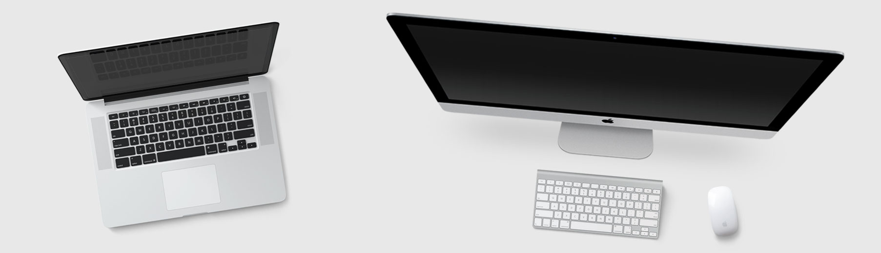
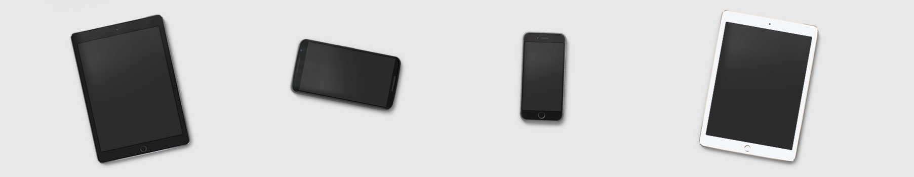
Responsive Web Design
Everything we build is responsive. A single design and codebase adapts to any device or screen size, automatically.

What is Responsive Design?

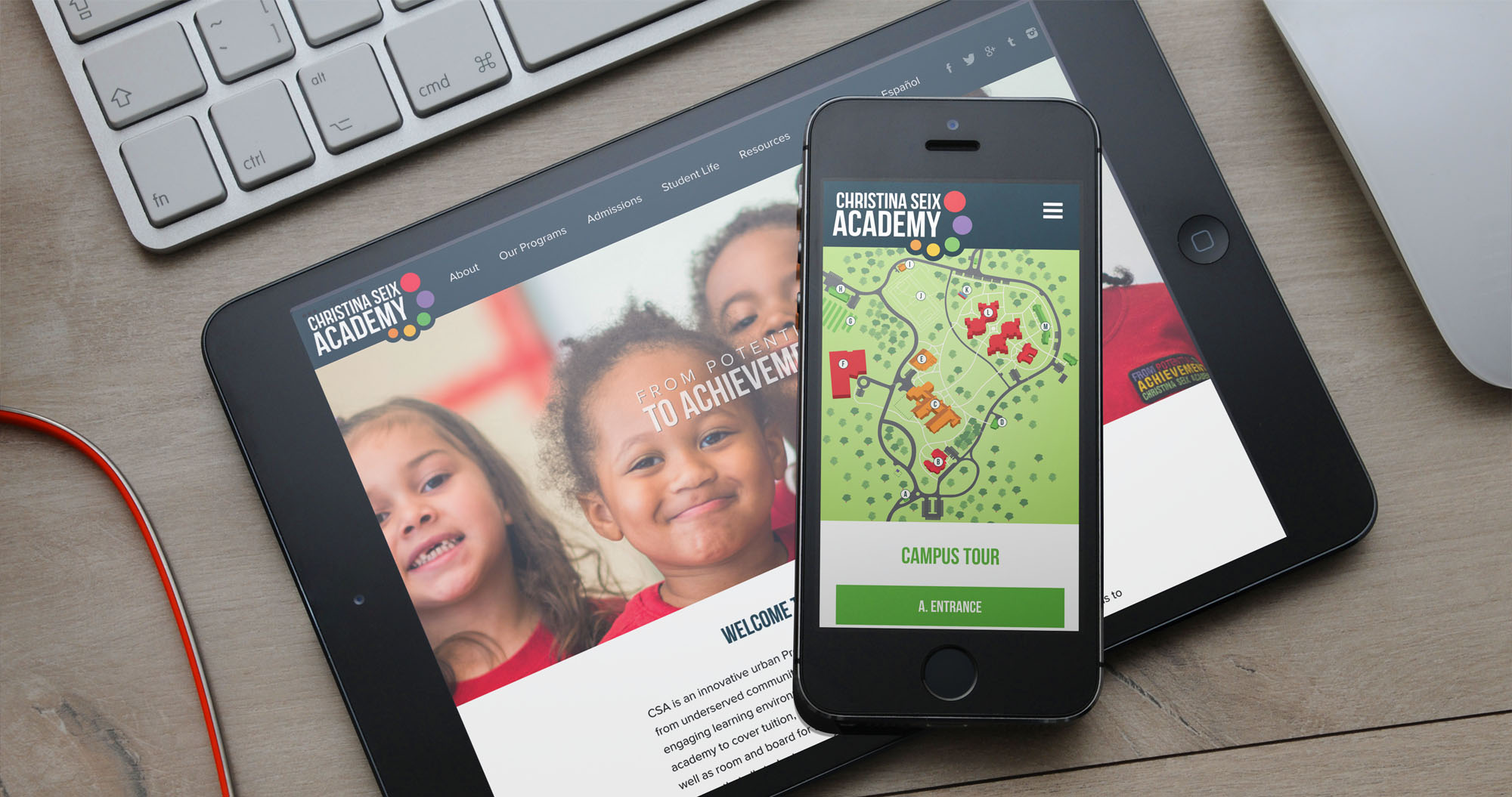
Responsive design is an approach to web design that ensures a website’s main focus is brand, content and message... no matter where that content is consumed.
Using a single codebase and a single design across different devices means that text shifts in size and format, images are optimized for load time, and user interface elements adapt to the device and input method they’re being viewed on.
Users will have the same experience on their mobile phones as they do on their desktop computer at home, without the need to build and maintain different instances of the same website or application.
Why Responsive Design?
With the growth of web traffic on mobile and tablet devices, responsive design is the new standard. You’ll reach users wherever they are today, and you’ll be ready for the next device before it comes out tomorrow.
- One website works for desktop, tablet, mobile and any devices in the future
- Google’s algorithms reward responsive properties and don’t need to figure out the existence of corresponding desktop/mobile pages
- You can update content for every device at the same time from a single CMS
- Consistent url structure means that when your users share your content, whoever views that link will get an optimal experience no matter what device they’re on
- You’ll ensure a consistently branded experience across all devices
Why Hire Brolik To Build Your Responsive Website or Application?
Responsible Responsive Design
A lot of agencies are talking the talk, but most aren’t as knowledgeable and experienced as Brolik when it comes to responsive design. Responsive design philosophies are at the core of everything we develop, and they have been since 2011.
We’re Industry Experts
Beyond our own blog, we’ve been published in Smashing Magazine, A List Apart and more, teaching others responsive design concepts and techniques.
We Build Custom
We don’t use responsive templates. Every website or application we develop is completely custom, built off of our responsive framework.