It’s important to project the best image of your business, and your website is no exception to this rule. The web is likely the first place your customers and potential customers are going to look to learn about your business. You don’t want to deter them by looking outdated and out of touch, or by making it impossible for them to access the content they came for. Just because you aren’t actively hearing complaints about your site doesn’t mean there isn’t a problem. Most people will simply leave your site if they don’t enjoy their experience or find it difficult to access valuable information. Check out the following list to see if you’re overdue for a website redesign.

Your Website Is At Least 3 Years Old
It’s a good rule of thumb to redesign your site about every 2-3 years, and it’s important to make periodic updates to keep current between redesigns. The web is ever-changing, and not just in terms of design styles. There are always new developments that create better, more user-friendly experiences for web users. As an agency, we redesign every 1-2 years and make updates all the time. Staying up to date with current design trends and new usability techniques creates a better experience for your users and keeps you on the cutting edge. To put it in perspective, imagine if your favorite clothing store stopped updating their look and store design. Would it still be your favorite store after three years?

Your Site Isn’t Responsive
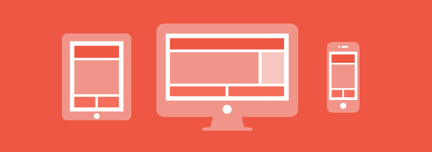
You hear us pushing responsive all the time, and for good reason. Responsive design is about good usability. It’s smart, and it ensures your customers will experience your site as you intended no matter where they view it from. Once thought of as a trend, it’s become recognized as the new standard in web design. We access the Internet from an absurd amount of different devices, all with different screen sizes, and that’s not going to change anytime soon. You need to account for the wide range of screen sizes your users will view your site on, and take advantage of responsive design to cover all your bases.

Loading Takes Forever
We humans have pretty short attention spans (about the same as a goldfish) and even less patience. We want everything on the web to be lightning-fast. If your website takes more than 4 seconds to load, you’re likely to lose a third of your visitors in that time. As ridiculous as that statistic may be, it doesn’t change the fact that the longer your page takes to load, the more customers you’ll lose. Another important point to consider here: Google considers website speed in their search ranking algorithms, meaning you’ll fall further down the list of search results if your site is slow.

Your Site Isn’t Search Optimized
This ties in with my last point about getting buried in search results. The whole reason you’re online is so your customers can find you there. Accessing your site is how your customers will find crucial information about your business, figure out how to get in touch with you, and potentially purchase your products/services. If you’re getting buried under your competition in search results, you need to do something about it.

Your Site Autoplays Music or Video
This one is less common, but nonetheless annoying. Users like to choose what content they engage with, you can’t force it upon them. I almost always leave a site right away if it’s playing music because it’s startling. More often than not, your users are going to be in a situation where they don’t want an electric guitar solo or the sweet musings of Kenny G blaring from their computer without warning. So just don’t do it.

Your Site Is Tiny
If your site is only 800 pixels wide and you’re using 12 point type, I’d like to know the reason why. Most desktop users keep their browsers wide enough that you shouldn’t feel forced to cram everything into one little square. (And if they don’t, all the more reason to go responsive!) There’s plenty of real estate to work with, so space your content out and give it some breathing room. Tiny websites look dated, and your users shouldn’t have to use a magnifying glass to access valuable content from your site.

You Have a Flash Animation ”Enter Site” Intro
This is just a way outdated trend. Watching an intro takes up your users’ time and deters a lot of people from the site. There’s really no reason or benefit to having an introduction to your site and most people will just click the skip button anyway. Another thing to consider, Flash animations don’t show up on iPhones and iPads, so a lot of people are going to miss this content regardless.

You Can’t Update Content
The inability to control what’s on your site makes it impossible to stay current and provide your users with the most up-to-date info about your company. The lack of current information will not only make your site look dated, it can also hurt your business. If you’re no longer offering a certain product or have extended hours of operation, your customers need to know. Make sure that you enlist the help of good content management system when you redesign your site. I should mention that we have a kick ass design team here at Brolik, and our own CMS platform so you can stay up to date.

Your Site Doesn’t Link to Your Social Media Accounts
Having a social presence online is crucial now. If you aren’t sharing those accounts with your target audience on your main channel, your website, then how will they find you? Social media is a great way to build a relationship and keep in touch with your customers, as well as promote your business. It’s as simple as including the social links in the header or footer of your site, or the contact/about page. This way, your customers know exactly where to find you and can engage with your updates.

Even You Like Your Competitor’s Site Better
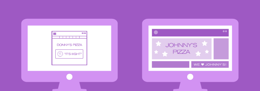
If you find yourself spending a sizeable amount of time creeping around your competitors’ sites and admiring the scenery, it’s probably time to step up your web game. Their site may be easier to navigate, more organized, or even just nicer to look at, and it’s safe to assume your potential customers are going to spend plenty of time there if you do.
If you’re guilty of one or more of these signs, it‘s time to consider redesigning your website. While some of these signs may be individual problems that you can fix and keep your current design, a good number of them are signs of a larger problem, especially if you’re guilty of a few. Having a solid website is part of sustaining a successful business, so don’t let yours fall behind the competition.