Usability is the most important function of every website. It doesn’t matter how attractive your site is. If it isn’t easy to use, it won’t engage your audience. While the following tips are the best practices that I’ve developed over several years, they’re open to interpretation and are simply what I believe is generally important. As technology continues to evolve, these tips will evolve as well, but the main concepts and principles will stay the same.
1. Typography
I cannot stress the importance of good typography enough. Your website must convey the relevant information in the most effective and aesthetically pleasing way possible. You accomplish that through good type.
Size: While designers love SMALL, ALL CAPS, SANS-SERIF, it is awful for readability on the web, especially with the rise of mobile users. For body copy, I’d recommend nothing smaller than 13px and a serif font for overall readability.
Space: Kerning and leading are technical terms that refer to the spacing between the individual characters and the lines of text, respectively. Both are incredibly important in overall readability as well as actual content comprehension. So space your type out, but not too much, and watch as your users actually read your content.
Color: Pay attention to the contrast between your text and the background color. Most of this is common sense, but you don’t want your users straining their eyes to read your content. Don’t use two colors that have similar chroma (the intensity or saturation of the color). Use spot colors to call attention to important headlines or call to actions, but don’t overwhelm the user with too many colors or variations.
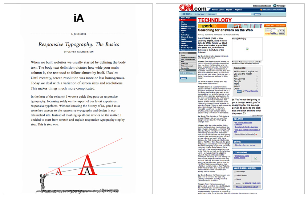
Compare Information Architects beautiful typography against CNN's Technology Section. iA uses a massive 21px serif font with 32px line-height for body copy.
2. Scanning and Skimming
You want to keep your content as concise as possible. Your users should be able to easily skim your content. This means using titles, subheadings, bold type and color to convey the relevant information in as few words as possible. It’s estimated that, on average, users only read the first eleven characters of titles and calls to action. Don’t use fluff, make every word count. For example, instead of using “Continue to Checkout” use “Checkout Now.” It’s shorter and to the point.
3. Important Things to the Left
In the Western World, users instinctively start reading at the top left of each page. As people scroll, they also spend the majority of their attention focused on the left side of the page. Jakob Nielsen estimates that users spend 69% of their viewing time on the left side of pages. So plan accordingly. Lay everything out with this key concept in mind, placing important content and links towards the top left of pages.
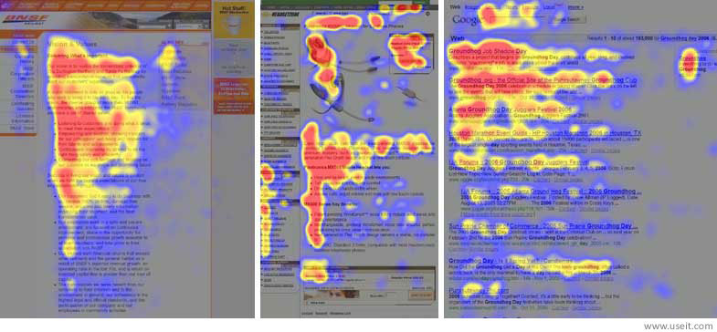
"Heatmaps from user eyetracking studies of three websites. The areas where users looked the most are colored red; the yellow areas indicate fewer views, followed by the least-viewed blue areas. Gray areas didn't attract any fixations" (Nielsen, 2006).
4. Use Whitespace Effectively
When used properly, whitespace makes your content more digestible. Proper left and right margins around copy, as well as space between paragraphs, increases your audience’s comprehension of your content. Text that doesn’t have room to breathe is intimidating and will largely go unread by your users. Whenever you can, break up large blocks of copy with lists, images, and quotes. Use whitespace to group sections together and differentiate them from others to create hierarchy.
5. Consistency
I preach consistency in all walks of life. From fitness to finances to web design. Making the correct decisions compounds over time. With websites, develop a system and stick to it. Websites are usually composed of a header, some content, and a footer. The header and the footer should be the same on every page. Same with the design of the titles, subheadings, and buttons. You don’t want to confuse users by changing your system from page to page. Develop a uniform page structure so your users will know where all the important page elements are.
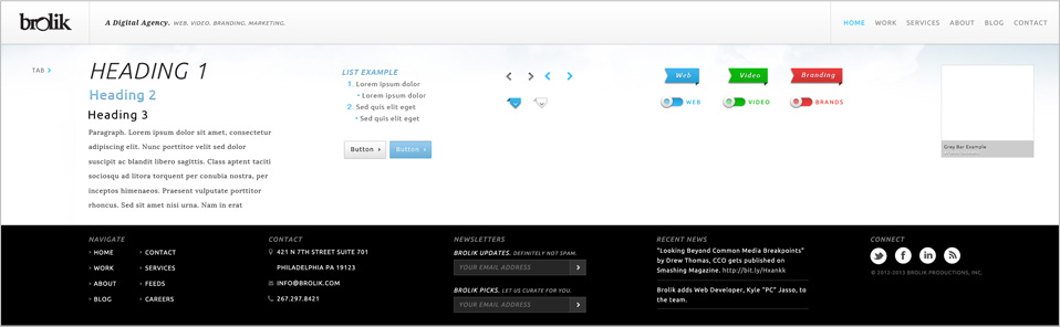
The system we developed for the new brolik website.
6. Responsive Design
The consumption habits of your users have undergone a serious change over the last few years. There has been a considerable shift from desktops towards tablets and mobile devices. To appeal to this new audience, you need to optimize your site for these new devices. Problem is, there’s an ever increasing number of different screen sizes. The solution is to make your website seamlessly adapt to any screen size with responsive design.
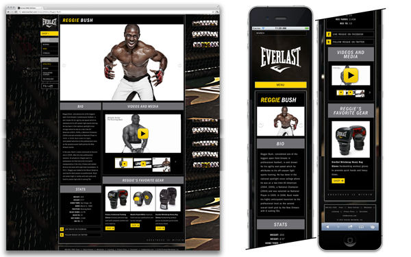
Responsive design uses media queries to create a flexible grid that adapts to the width of the screen. Columns and images will shrink and eventually stack as the screen's width gets smaller. Go ahead and resize this window to see it in action. This approach allows you to have one website, driven by one set of the code, that adapts to any current and future screen size with ease.
More Reading:
Responsive Design in the Real World (Part 1)
Responsive Design in the Real World (Part 2: For Designers and Coders)
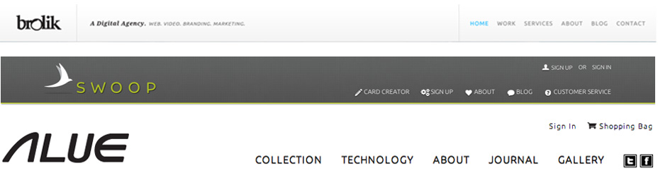
7. Clear, Simple Navigation
Good navigation should be simple and intuitive. Position it at the top of every page and keep it consistent throughout your site and limit the number of options. You don’t want to overwhelm your users with too many choices. Your logo should be in the top left of the menu, not too big, and it should link back to the homepage. Don’t say “Company Information and Team Bios” when a simple “About” will suffice. It’s also fairly common for “Sign Up” and “Sign In” links to be in the top right of each page if applicable.
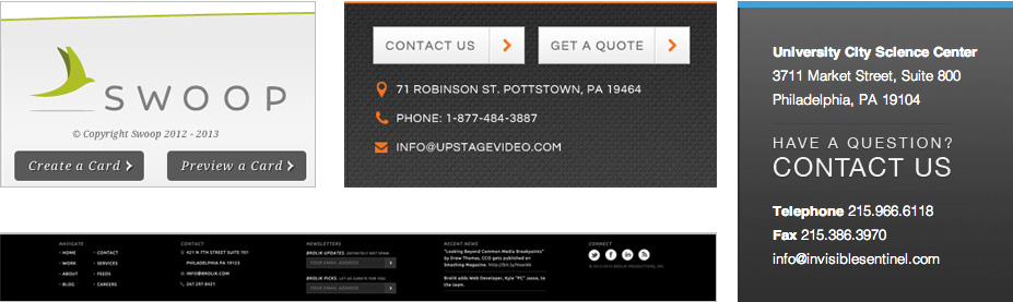
8. Rich Content Footer
I’m a big fan of informative footers. It’s free space tucked away at the bottom of a site. Why not use it to the user’s benefit? Include a sitemap of at least the major site links and contact information, with email, phone number, and physical address if applicable. Reinforce the branding with the logo, a legal copyright message, and your mission statement or quick “about” blurb. This is also the place for social media icons and any other relevant information that your users would quickly want access to, like a site-wide call to action.
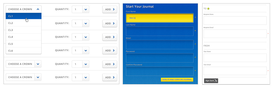
9. Linear Forms
From registration to check out, collecting user information through forms is an important part of many websites. Users fill out your forms from top to bottom, so it makes sense to have them flow accordingly. It’s a good idea to place the labels directly above the relevant input. Keep the forms simple to avoid distracting your users.
Also, avoid placing two forms directly next to each other. While space saving, it’s not a natural movement for the user. Highlight the active form field with a color shift or an inner shadow or an outer glow. Mark the required fields appropriately. Also, make your forms as short as possible. Don’t require a telephone number if you don’t absolutely have to.
10. Short, Descriptive URLs and Permalinks
Having a short domain name and clear and descriptive URLs makes your site easier to remember and link to. You’re assuring your users what they’re about to read. If you can, hide the page extension with your .htaccess file. Non-nerds, disregard this:
RewriteRule ^([^\.]+)$ $1.php [NC,L]
The URL brolik.com/about just looks better and more professional than brolik.com/about.php.
Conclusion
Every element on your website should add to the overall user experience. From the overarching key concepts to the small details, your primary focus should be on usability. You’ll create a more satisfying experience for your users that will ultimately lead to more conversions. Now, analyze your site and keep these tips in mind to see how it measures up.