The Internet is an impressive piece of technology, forced to constantly evolve to keep up with the rapidly changing world around us. Users are accessing the Internet from an ever-growing number of devices. These devices are simultaneously getting smaller and larger, while also getting faster and cheaper.
Web browsers are also continuing to spur innovation. New features, languages, and techniques are becoming widely supported in modern browsers. As major companies drop support for old browsers, the modern day Internet is a new frontier with endless directions and possibilities.
As the technology of the web continues to evolve, user experiences and interface design must also evolve as content begins to drive function. As with anything subjective, there are certain trends and styles that emerge and gain popularity. With that in mind, let’s examine some of the current trends from around the web.
1. Simplicity
I can’t tell you how happy I am to see simplicity re-emerge as a popular trend within the web design community. It signals a shift in the general consensus from relying on flashy graphics to focusing on content and removing unneeded clutter. Web designers in general are rejecting skeuomorphism in favor of flat design. This general shift correlates with the need to create experiences that adapt to a wide variety of devices. I will always remember a bit of advice my dad told me that resonates with this concept, “When in doubt keep it simple, stupid.”
2. Responsive Web Design
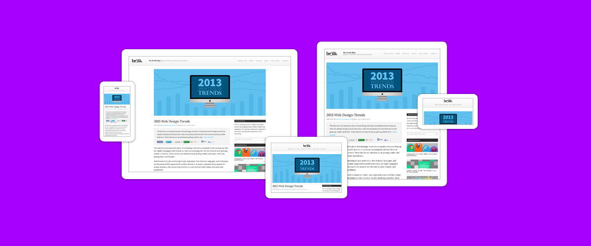
I am hard-pressed to even refer to responsive web design (RWD) as a trend anymore. It is simply the best solution for crafting digital experiences that span across different devices and screen sizes. As the number of devices and screen sizes continue to increase, there is no better alternative.
While responsive web design still has its challenges, it is the future of the web. And within this movement, it has become important to take a minimalist approach so that the user experiences can seamlessly adapt regardless of the device. This goes along with the trend of simplicity as web designers begin to focus on the content first, using things like typography as a core design principle to marry aesthetics, simplicity, and responsiveness.
3. Good Typography
No longer are we web designers constrained by the two dreaded words “Web Fonts.” A few years ago these two horrible words would send shudders down my spine. As a designer with a healthy obsession for typography, being limited to the traditional “safe web fonts” was a constant hurdle to overcome.
Today, the web has become a typographer's dream. With the adaptation of custom web fonts, a web designer can pick from an incredible variety of beautiful fonts and use them in some fun and innovative ways.
But with great power, comes great responsibility. Conveying information is at the core of the industry and typography is our medium to accomplish that. Good typography improves communication, comprehension, navigation, and most importantly it puts the content first. It is crucial to follow the general rules of typography in web design, paying attention to the details such as line-height, letter-spacing, font-size, font-weight, and padding. Also, it is important to consider all of these details at different screen sizes through the use of responsive web design.
4. Parallax Scrolling

Parallax scrolling is a technique that has been used in video games since the 1980s, where the background scrolls slower than the foreground to create a 3D effect within a 2D environment. When used properly, parallax scrolling can add a great subtle effect of depth to a website. All that it takes is some basic HTML/CSS structure and a few lines of jQuery. Here’s an abbreviated parallax scrolling tutorial from a jQuery plugin we developed at Brolik called ScrollCSS.
$("element").scrollCSS({
    cssProperty:"marginTop",
    cssStartVal:"0px",
    cssStopVal:"100px",
    scrollStartVal:100,
    scrollStopVal:800
});
The above code would cause the margin-top on an element to change from 0px to 100px as the user scrolls between 100 and 800 pixels down the page. The same thing happens in reverse as the user scrolls back up.
Parallax scrolling can add a simple and engaging effect to your website without detracting from the function. But fair warning, the technique should be used sparingly and in the right circumstances. Avoid overuse or misuse, which goes for any trend.
5. CSS Animations

I have become a big fan of CSS animations now that they’re well supported by the major modern browsers. CSS3 animations can bring a website to life by adding a touch of motion and finesse to otherwise clunky and abrupt transitions. With the continued demise of the Flash website, it is nice to see a new lightweight and flexible alternative emerge. We’ve been using CSS animations at Brolik for hover effects on buttons and modules as well as responsive design transitions as a browser is scaled down. But with any new emerging technique, proceed with caution.
6. Fixed HTML Header (AKA Sticky Nav)

The fixed header is a good usable detail to add to a site. When done properly, it keeps the navigation in an easily accessible location, without intruding on the content of the site. It is a popular technique that many websites are implementing at desktop sizes, where screen real estate is abundant. It requires one simple jQuery function to implement.
$(window).scroll(function() {
     if ($(window).scrollTop() > 0) {
          $("header").addClass("fixed");
     } else {
          $("header").removeClass("fixed");
     }
});
I like this technique because you can make the header position:relative inherently which gives you more control for responsive design changes later. You can also implement some CSS animations on the class "fixed" to do things like decrease the padding, shrink logos, and even reorganize elements. In most cases, it is also a good idea to use responsive design to stop the header from becoming fixed at mobile sizes, as screen real estate is at a premium on smaller devices.
7. Retina Support
The reign of the 72 dpi screen is beginning to come to an end and now is the time to start support for higher resolution devices. Since Apple introduced the Retina Display in 2011 with the iPhone 4S, the industry trend has been moving towards these pixel dense displays.
There are some key techniques to implement to properly support Retina Displays, and while this could warrant its own individual blog post, I will briefly touch upon two techniques for images.
Photographs
Use Responsive Img to detect the display and serve up the appropriate resolution images. It is very easy to implement once you include the jQuery plugin.
$("img").responsiveImg();Icons
Use sprite sheets and CSS background images for icon sets. We’ve been using sprite sheets at Brolik for all of our icons and it’s as easy as creating a high resolution sheet, saving it down for 72 dpi screens and using a CSS media query like so:
.sprites {
     background-image:url(sprites.png) transparent no-repeat;
}
.sprites.arrow {
     height:15px;
     width:8px;
     background-position:0 0;
}
.sprites.arrow:hover {
     background-position:0 -25px;
}

@media screen and (min-device-pixel-ratio: 2) {
     .sprites {
          background-image:url(sprites@2x.png);
          background-size:250px 250px; //Size of 72 dpi sprite sheet
     }
}
Conclusion
Nothing can be said to be certain except death and taxes, and the fact that technology will continue to advance at a breakneck speed. When approaching web design going forward, consider the key overarching concepts above, and begin implementing some of the specific techniques to add some visual interest to your website. The only constant in web design is change. This concept we must fully embrace to stay on the cutting edge.