(Update 10/21/16 - With Facebook’s recent policy changes regarding text on ad images, this article is finally completely irrelevant. Why? No more 20% rule! But there’s more to the story, so I revisited Facebook’s 20% rule in a new article that examines what we’ve learned from the rule, and how the new policies work. Hope you find it helpful.)
(Update 2/26/15 - I have updated this article based on the continued changes that Facebook has implemented surrounding this rule. The bad news is, they've made it much harder to circumvent. It looks like we're just going to have to get used to the 20% rule!)
In the last several months, Facebook has been making small changes to their platform so quickly that it can be difficult to keep up. For a basic user, these changes might not even be noticeable, but for social marketers, the effects have been annoying at least. There have been few changes to the Facebook platform that we have found more annoying than the “20% rule.”
The what?
The 20% rule bars advertisers from using images that are made up of more than 20% text as promoted posts on the network. The decision as to what constitutes 20% isn’t an exact science at all. It’s based on a 5x5 grid that is overlaid on the image. If any five out of the 25 blocks in the grid contain text, then the Facebook algorithm will flag the ad in violation of the guidelines. They even provide a handy grid tool that allows you to run the test yourself. Of course, you can only use the tool once the image has been created, so it’s easier to just bring the grid into Photoshop or whatever you use to create the image. Either way, it’s a pain.
Now, I’m not usually one for gaming the system. If you’ve read any of my previous musings about developing a long term SEO strategy, you’ll know that I constantly preach the merits of swimming with the tide, instead of attempting to battle giants like Google and Facebook. This is different. I hate the 20% rule. We had grown accustomed to the high CTR and great content that could be created using engaging imagery with strong copy overlaid. So, when the 20% rule started getting in the way of some of our favorite tactics, I started to look for ways around it. Here’s what I’ve found.
1. Use a promoted link ad
(2/26/15 - This is no longer an option for avoiding the 20% rule, which now applies to "clicks to website" ads and "page likes" ads as well. Oh well...)

Based on our research and use, it seems that Facebook has only applied this rule to image-based posts, which leaves a great opening for link posts. Of course, this requires a destination for the link, which takes a little more thought and preparation, but the site traffic that can be gained is well worth the effort. For posts like this one for Rehab Financial Group, we post them to the page on a weekly basis using Sprout Social, then promote the post using Power Editor. Easy and effective. I have seen social marketers complain that this isn’t the case, and that link posts are subject to the rule as well, but it’s been working for us. Give it a shot and let me know how it goes.
2. Creative type treatment
(2/26/15 - Facebook's recognition algorithm has gotten better and better, which affects both tips 2 & 3. It's still possible to juke the system, but it's getting a lot harder and may take a couple of tries. )

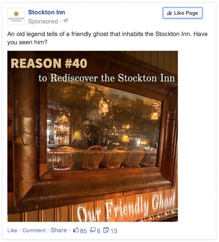
Facebook uses an automatic image recognition process to flag ads for violation of the 20% rule. As such, it can be tricked by manipulating the text so that it doesn’t look quite as much like text. Some simple creative type treatment can easily thwart the system and get your ad through. This example for the Stockton Inn uses a “ghostly” blurriness and slight change of angle or perspective to get through the filter. This tactic does come with some risk though. If you don’t manipulate the text enough and are unable to confuse the algorithm, you may get rejected and have to go back and rework your image. Also, you can expect the image recognition to continue to improve, so we can count on the effectiveness of this method declining over the coming months.
3. Hide the text in the image

This is somewhat similar to the previous approach, but slightly different in its tactic. The goal of Facebook’s 20% rule is to limit text overlay on images, not text that may be included in the image. If I were to take a picture of a street sign covered in text, Facebook would gladly allow me to promote it. We can use this to play the system a little bit by making text part of the image, instead of simply laying it on top. Use perspective and shading to make your overlay fit into the image like it is part of the original photo, and you’ll get right through the system. We have a team of graphic designers here at Brolik that make this kind of manipulation very easy. If you don’t, consider using a service like PlaceIt, which allows you to upload an image and place it onto the screen of a device. If you’re able to easily take high quality photography there’s no end to where you could go with a little creativity. Paint a mural? Make words out of K’Nex or Legos? The possibilities are really endless.
Sure there are ways to stay within the rules and still create great ad content. You can go a long way with really good imagery and strong status text. But sometimes it pays to color outside of the lines, and really, you have very little to lose. Give it a try and see what you can come up with.