Does this conversation sound familiar?
Client: “Can you make the logo bigger?”
Designer: “Okay, I understand that the logo is the image that encapsulates the brand, and it needs to be prominent. But, it is just one visual aid in the toolbox and there are a lot of other variables that contribute to your overarching brand that deserve prominence. We also need to think about hierarchy and usability.”
Client: “Just make it a little bigger.”
Designer: “Okay, fine.”
This is an innocent enough request, and one any experienced web designer has certainly been asked many times. I think having a healthy back and forth with a client is an important aspect of creating a well rounded website, but there’s a reason designers often push back on this request to increase the logo size. Sometimes making the logo bigger can actually negatively affect your website. Let’s examine some of the reasons behind the request and some reasons why it’s often not a good idea.
Why?
Clients generally want the brand to be more prominent and noticeable. The natural reaction is to increase the logo size. While brand recognition is crucial to any marketing initiative, there are other goals that are also very important. Striking a good balance between all of these is the overarching goal of the website.
Is brand ego the driving force behind this request? While pride in your brand is admirable, it can send the wrong message to users. Your website is not built to serve you, but rather to serve the needs of your users.
Hierarchy
The size of the logo and the other corresponding elements is a crucial detail of any website. But consider this, is the logo the most important element of your website? Is it more important than the product or service that you are offering? No one is actually buying your logo, so why does it need to be the most important element on the page?
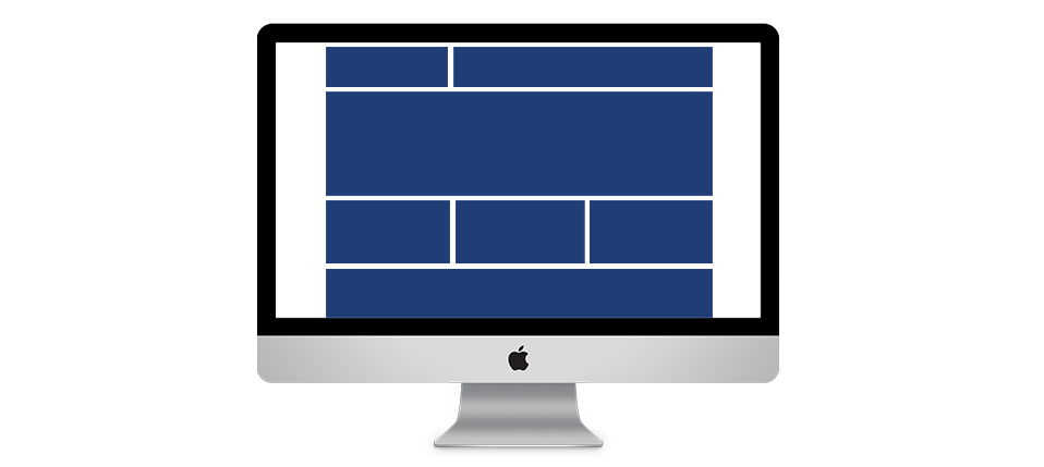
Between the logo, navigation, content, and calls-to-action there are a lot of variables at play. A designer needs to achieve a tasteful balance between all of these elements to form a cohesive product that reflects the brand. By placing too much importance on one element you can easily dwarf the others. To quote the great graphic designer Paul Rand:
“Preoccupation with any one element of a visual object at the expense of others is impoverishing, and poverty in the literal sense is not a virtue of design. It is my contention that all the formal elements which comprise a package must be treated with understanding, with love, and with an equal amount of dignity.”
Usability
The area visible without scrolling (above the fold), is the most important area of your website. The problem with making the logo bigger is that it pushes every other piece of content down the page, hogging prime real estate.

Users visit your website for the content or to perform a specific task, and by increasing the size of the logo you can often overshadow the actual goals of your website. Your logo doesn’t help your users accomplish anything.
Trust
A request to make the logo bigger is often due to the pride a client feels for their brand. This is an admirable trait, but it is important to take a step back and approach the situation from the perspective of a user. Users are overwhelmed with images and marketing messages every day of their lives, and increasing the logo size is only going to contribute to this clamor.
Rather, focusing on fostering an emotional connection and fulfilling your customers needs will establish a level of trust between your brand and your users that will ultimately lead to happier customers and more conversions.
Examples
Take a look at some of the headers of prominent brands from around the web:
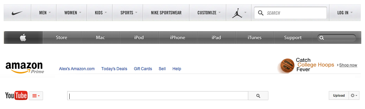
These brands have achieved good hierarchy and in turn good usability. Notice how the logos are relatively small with ample white space surrounding them. Nike and Apple are such household names they even drop their logotype and just use their mark for even more of a minimalist approach. To be blunt, your users aren’t blind. Your logo doesn’t have to be enormous in order for them to recognize your brand.
In Conclusion
Your logo is important from a brand recognition perspective, but focusing on the content and needs of the user is going to result in the most effective website. It is not the logo that will bring customers back to your website, it is the content, the service, and the trust that you establish that will make customers return. Your logo should be prominent, without being dominant. It can be a very useful tool, but just remember it is only one visual aid and not the entirety of your brand.