Can you give us some background on the MLSPA rebrand?
The MLS Players Association was experiencing a period of growth and brought Brolik on to help position their brand to reflect that. It was a slightly unusual branding project for us. Normally, we’re trying to market a product or a service and generally focus the brand aesthetics and positioning around business growth, but the MLSPA’s sole purpose is to serve the players of the MLS as a labor union. Therefore, our goal was to create a brand that resonates with the players, reflects the PAs objectives, and looks good while doing it.

As a soccer player and fan of the sport for my entire life, this was a dream project for me. It’s always enjoyable to work for a client that you’re passionate about and the MLSPA is no exception. They are a great organization, full of quality people, serving some of the biggest stars of the sport. Needless to say, it was very easy to get excited about this project.
How do you go about approaching your inspiration and process?
We approached the MLSPA rebrand just like we would any other branding project, by starting with identifying the target audience and the competitive landscape.
The primary target audience was the 654 active players in the MLS and the secondary target audience was the retired MLS players pool. It’s rare when we get to focus our research so finitely and it really improved our ability to gather valuable insights and feedback as we moved through the process. Beyond those two groups, we wanted to pay close attention to the opinions of MLSPA stakeholders and make sure to appeal to the league and the fans as well.
Our internal team began conducting phone interviews with MLS players that ranged from rookies to veterans to get their perspective on the MLSPA. The players understood the importance of what the PA does and were receptive and willing to help us as we badgered them with questions. They gave us valuable insight into how they perceive the Association and provided us with a great foundation of knowledge to build from.

After learning about the target audience, we spent time studying the competitive landscape within the sport of soccer as well as the other national sports associations. We studied how these organizations positioned their brands and how they talked about themselves on their websites and social platforms.
With so many stakeholders that have attachments to certain aspects of the brand, what were some challenges you faced?
There’s always a challenge when rebranding an established company. There’s an accepted and familiar look and feel about the organization and simply replacing that with a new system would be a shock to the audience.
When updating an established brand, it's essential to pay homage to where the brand came from.
Throughout our discovery process, we found that there was a strong fondness of the concept within the existing branding. The idea of the players standing together in a wall representing the ideas of unity, solidarity and brotherhood. Even though we were rebranding the Association, their message and objectives had not changed. Therefore, one of our main goals was to explore this concept and see if we could simplify it so that it would fit a modern brand.
Did the league’s players have any role or input?
Getting input from the key target audience segments is crucial in any project, and this one was no exception. I largely attribute the success of the MLSPA branding project to the fact that we involved the players from day one.
Throughout the process we were able to gain key insights into the players feelings about the direction we were taking the brand. We encouraged the MLSPA to send our branding presentations to the players and we in return got some great feedback. They were very specific in their thoughts and we gained some valuable feedback that was instrumental in shaping the final output.
How much time was spent researching and building out concepts before you started designing?
Before starting to design, one of our first steps is to pull together some inspiration. As Picasso famously stated,
“Good artists borrow. Great artists steal.”
Which might be off-putting on the surface, but it’s an important part of becoming immersed within the aesthetic culture of the project. So, we put together a Pinterest board to organize our inspiration.

We pulled together inspiration from soccer teams, other sports teams, player associations, labor unions, making sure to include different styles, visual elements, and executions. Essentially anything that tickled our fancy and could spur on a creative rabbit hole to explore.
At this point, before launching into design, we needed to dust up on our sports branding skills. So, borrowing a concept from Erik Kennedy, our design team began to imitate some of our favorite pieces of inspiration in the form of copywork. We took a few of the sports and union badges and spent some time recreating them. This exercise is about expanding your “visual vocabulary” and forcing you to “remake every decision that the original designer made.” It helps you understand what design decisions were made and the key details that collectively work together to make the final piece what it is.
As we recreated the badges and crests of famous brands, we began to understand the difference between a rounded crest and a pointed crest. We began to question where the crest should break from vertical to curve, and how that affects the feel of the overall shape. We were forced to examine what it meant to align text on a path to the baseline or the center, and how that affected the final output and legibility. What does line-weight do to the final output? Mixing two line-weights can give the logo depth and nuance, at the trade off of visual clutter.
This exercise allowed us to fully immerse ourselves and understand the aesthetic and creative landscape that the brand would ultimately live in.
How did the design of the brand take shape from an idea to a fully finished piece?
As you can probably tell, we spent a considerable amount of time gathering information before ever launching into the brand design. It’s imperative to understand where the brand has come from to fully understand where it should go. And once we finally started the branding process, we had a wealth of knowledge, inspiration, and newly honed design skills at our disposal.
We look at our branding process as a large funnel, where we start with a wide range of design directions, and then we iterate, critique, and refine. We go through several rounds of internal revisions before ultimately going through the same process with the client and target audience involved.
In our first design round, we spent time exploring a few key directions. Including a minimalist translation of the existing brand, a literal player focused direction, a straightforward refresh of the existing brand, and lastly an abstract representations of the union.
The minimalist translation of the existing brand was the clear favorite across the board. So with a strong direction chosen for our second design round, we began refining the details. We explored every aspect of the final mark, examining the shape of the crest, color, and line-weight amongst several other visual details resulting in hundreds of different variations of the final output.
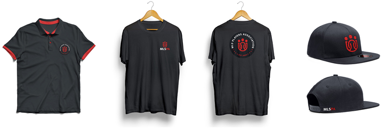
The
final branding was the result of a process rooted in research and built
through iterative evolutions. Ultimately, this has been one of the most
satisfying branding projects I have ever worked on and I am excited to
continue to help the MLSPA grow their brand.