By Hannah Volz
Thursday April 2nd, 2015
If you’re a designer, you’re no stranger to the stereotypical client commentary; “Can you make the logo bigger?” “We want it to POP!” and the like. We’re all familiar with the ridiculous and sometimes painful things clients say. But how often do we stop to think about the flip side of the coin?
Full Story
By Hannah Volz
Wednesday November 19th, 2014
You cannot assume that your only job is to make your client happy. You also cannot disregard the opinions of your client. The ultimate goal for designers who want to build strong client relationships is to strike that delicate balance between the two.
Full Story
By Hannah Volz
Tuesday August 19th, 2014
For as long as there have been companies to rebrand, there have been designers to make snarky comments about their new identities. Designer hate has always been around to some degree, but not as it exists today. Why is everybody jumping on the designer hate bandwagon?
Full Story
By Hannah Volz
Wednesday April 30th, 2014
The design industry is highly saturated these days, thus increasing the level of quality necessary to be truly innovative. I've compiled some noteworthy work from various mediums of design to highlight the innovation that still exists in such a crowded market.
Full Story
By Hannah Volz
Friday February 21st, 2014
“I’d say the greatest improvement I’ve made over the last year is becoming more comfortable designing for the web. I try to consider the user as much as possible throughout the design process.” - Hannah Volz, Designer
Full Story
By Hannah Volz
Thursday October 10th, 2013
It’s important to project the best image of your business, and your website is no exception to this rule. The web is likely the first place your customers and potential customers are going to look to learn about your business. Check out this list to see if it's time for a redesign.
Full Story
By Hannah Volz
Monday July 29th, 2013
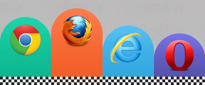
There are a ton of browser options out there, and for the amount of time we all spend on the Internet, you don’t want to waste any more time waiting for pages to load. To help shed a little light on the benefits and drawbacks of what’s available, I’ve created an infographic detailing the features of various browsers.
Full Story
By Hannah Volz
Wednesday June 5th, 2013
Previously, I wrote about how modern web design has become much more visual, with large imagery becoming the central focus. The emphasis on visuals and grid layouts is especially prevalent on social networks, like Facebook and Pinterest. Now another social media platform is joining the ranks: Google+.
Full Story
By Hannah Volz
Tuesday March 12th, 2013
If you’re thinking about adding infinite scrolling to your site, there are a number of factors that you need to consider before making any decisions. Make sure you have a strong understanding of the kind of content you share and the people who are viewing it.
Full Story
By Hannah Volz
Tuesday November 27th, 2012
Increasingly over the past few years, we’ve seen a shift on the web from largely text-based layouts to a focus on imagery. While a desire for engaging visuals definitely plays a role in this shift in design style, another factor plays into this as well─ our decreasing attention spans.
Full Story
