Examples of Innovation In Design
Wednesday April 30th, 2014The design industry is highly saturated these days, thus increasing the level of quality necessary to be truly innovative. I've compiled some noteworthy work from various mediums of design to highlight the innovation that still exists in such a crowded market.
The design industry is highly saturated these days. The popularity of branding, web design, marketing, and related fields has skyrocketed in the last few years. This is a result of increased awareness of the value of design, as more companies seek competitive advantages in their respective markets. It’s great that there’s new attention being paid to branding and more efficient, better looking websites and products. However, the increased volume of better design work does make it more difficult to stand out and be truly innovative.
Of course, there are still a number of designers, agencies, and companies out there who do exceptional work. I’ve compiled a few examples of noteworthy work from various mediums of design to highlight the innovation that still exists in such a highly saturated market.
Branding
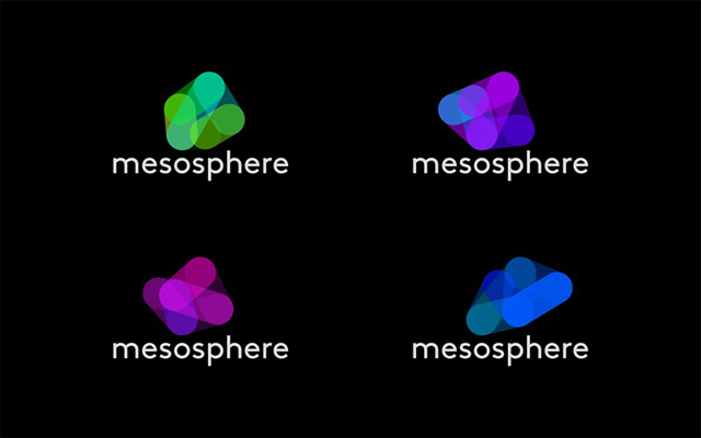
A few iterations of Mesosphere’s logo.

A preview of Mesosphere’s logo in action.
Mesosphere has an identity that is fluid, as opposed to the usual static, unchanging mark. They’re a startup based in San Francisco developing an operating system for data centers that simplifies cloud operations. Designed by Ammunition, the mark is a form of the letter “M” and uses its five points as vertices to connect and shift into various shapes. According to Ammunition, the colors were inspired by the earth’s mesosphere, where both cool and warm colors blend together.
In terms of innovation, I can’t recall any other brand with a mark that is constantly in motion. I think it’s very unique and well executed. The fact that there are so many iterations of the same form does not hinder brand recognition because the various forms are all similarly structured. Additionally, the color palettes, while varying between warm and cool, are consistent in tone and opacity. The unchanging, lowercase “mesosphere” serves to anchor this mark. Overall, I think it’s really successful and distinct.
Product Design
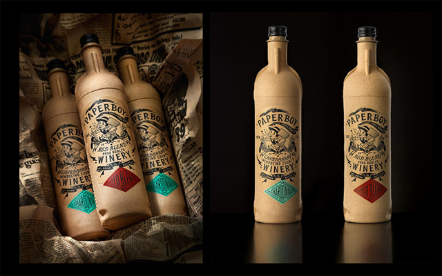
Paperboy Wine, designed with cardboard bottles.
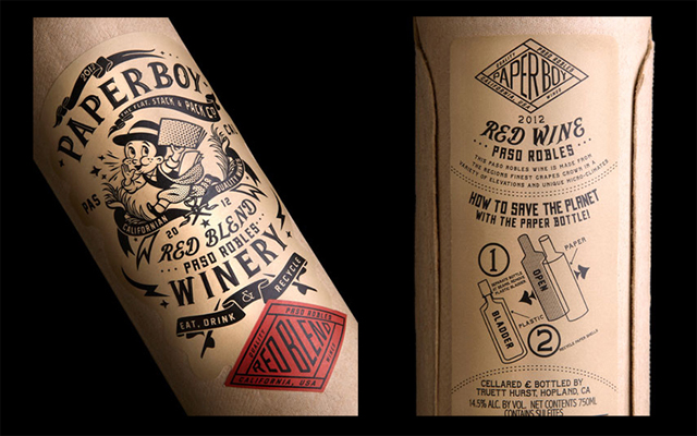
Label details.
In the three dimensional world of product design, the packaging for Paperboy Winery is exceptional. Paperboy Wine is the result of a partnership between Oakland-based packaging company Ecologic Brands and Truett-Hurst winery, and is designed by Kevin Shaw of Stranger and Stranger. The wine is packaged in compressed recycled cardboard shaped in the form of a Bordeaux wine bottle, with a thin plastic liner inside. They’re 85% lighter than glass bottles, weighing just under 2 pounds when full.
The difference in weight is not just a convenience to consumers. CEO Phil Hurst says, “If the 207.7 million cases of wine that are shipped annually in the U.S. were packaged in the Paperboy bottle… they’d save approximately 50,793,750 gallons of diesel and 560,000 tons of CO2.” Paperboy’s carbon footprint is 67% less than that of glass bottled wines.
This product and its design really knock it out of the park. Conceptually, it’s both innovative and sustainable. I love that the recyclable packaging is an important theme throughout the brand, and the raw cardboard isn’t covered with a bunch of color and varnish. The paper’s influence is apparent within the name as well as the vintage illustrations. The pop of color utilized for the label displaying the type of wine is a really nice touch. It’s tough to pick out something I dislike about this product. It’s truly innovative and very well designed.
Web Design
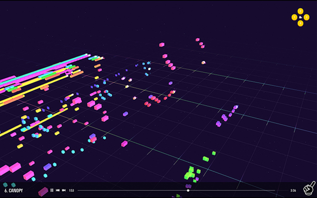
A preview of the interactive experience.
A preview of a song in action.
George and Jonathan make electronic music and crazy-techy but cool-as-hell sites to play their music on. Their newest website plays their latest album with colorful audio visualizations that allow you to see each note played while it’s happening. It’s also an interactive experience that allows you to shift your view of the notes being played. Designed and coded largely by the George half of George and Jonathan, the site is an advanced way to experience the relationship between audio and visual on the web.
As for the process behind creating the experience, here is what I’ve gathered from a bit of research. They compose the music in PxTone, which is a music editing program. Next, a Python script is used to convert it to data that includes individual notes of the songs. This allows them to create artwork to accompany the individual music notes.
In terms of innovation on the web, George and Jonathan have definitely hit the mark. Their site is like the iTunes visualizer on steroids. It seems like the process was long and challenging, but the output is definitely rewarding. It’s also impressive that they control every aspect of their music, from the production to the artwork to the complex code necessary to bring it all together. I encourage you to check their site out for yourself and experience their unique approach to audio visualization.
So What Does This All Mean?
While an oversaturated field may seem like a bad thing, it has the effect of elevating the level of quality work. It also has a higher list of requirements when it comes to being innovative, which makes for some truly standout projects. These work samples are a great representation of the high level of innovation happening across the design industry. Whether you’re interested in branding, product design, web design, or any other form of design media, there’s plenty of inspiring things happening right now.
Any other noteworthy projects to share? Comment below with what inspires you!