Famous Logos and Designer Hate
Tuesday August 19th, 2014For as long as there have been companies to rebrand, there have been designers to make snarky comments about their new identities. Designer hate has always been around to some degree, but not as it exists today. Why is everybody jumping on the designer hate bandwagon?
For as long as there have been companies to rebrand, there have been designers to make snarky comments about their new identities. Designer hate has always been around to some degree, but not as it exists today. The internet age has also become the troll age, because if you want to say something unsavory about another person’s work, you can hide behind the safety of your computer screen. Why is everybody jumping on the designer hate bandwagon?
This article isn’t intended to dive into the psyche of trolls and why they do what they do. That’s for someone else to worry about. I think we can figure out on our own why designers feel the need to cut others’ work down. Whether it’s to make themselves feel more confident in their own skills or just to feel like they’re part of the group… that’s not my concern here.
Why is everybody jumping on the designer hate bandwagon?
What I’d like to do is give a fairer assessment of some recent logo redesigns that have caught a lot of flack. Now, to be fair, some corporate redesigns do merit a negative reaction. If the infamous Gap logo fail of 2010 taught us anything, it’s that not all redesigns are a step forward. But I’d like to review these redesigns with a fair critique, rather than trying to come up with a clever way to bash them.
Airbnb
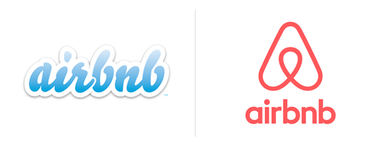
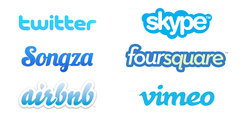
All the dirty-minded designers out there found about 100 different ways to turn this icon into something perverted. This poor logo has been compared to every part of the human anatomy where the sun doesn’t shine. If I had been presented the new Airbnb logo without any of the pervy commentary, my first thought would likely have been that this is definitely an upgrade from their previous logo. The old logo feels just like every other late 2000s startup logo – friendly script type set in bubbly blue letters. It was designed by one of the founders in a few hours. It wasn’t very original, which you can see when you place it next to other logos (and former logos, since redesigned) from this era.
The type choice for the new logo is safe and friendly. It’s a clean, geometric sans serif that feels slick and modern while still being approachable. The new logo can stand on its own as a creative mark, and Airbnb has used it on its own in many different applications – see more here. According to Airbnb, the icon is intended to be a fusion of people, places, love, and the “A” of Airbnb, to collectively create a symbol that “makes you feel at home wherever you are in the world.” It’s a lot to try to convey in one mark, so I think they probably could’ve relaxed a little with the storytelling, but as a mark it does make sense for the company, and I appreciate what they’re trying to communicate.
Another thing that many people struggled with was its similarity to Automation Anywhere’s logo. However, there seems to be no bad blood between the two companies, as they’ve since released a joint statement that their new logos were released around the same time and the similarities are merely coincidence.
All in all, it’s not the greatest mark in the world, but it’s definitely an upgrade from the previous logo. I think in time, people will stop picturing the mark as a mashup of various reproductive organs and come to appreciate it as a symbol that clearly fuses the map marker icons and “A” (if none of the other elements Airbnb described) to create a successful mark.
Olive Garden
In my humble opinion, the responses to Olive Garden’s new logo have been absolutely ridiculous. None of these critics will admit to actually liking the restaurant, yet they seem truly offended that Olive Garden has tried to improve itself with modern branding. This baffles me. Wouldn’t this be something that could possibly improve the experience there? Bobby Solomon of The Fox is Black wrote a great blog post about it that quotes some seriously ludicrous and irrelevant critiques about the new logo. It’s worth checking out, even if you just skim some of the insipid articles he’s quoted.
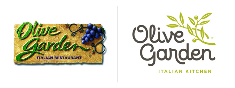
The old logo was appropriate for a while. The stucco texture and slab stone is intended to mimic the feeling of being in Tuscany having a glass of wine with pasta. Obviously being in an Olive Garden is nothing like being in Tuscany, and now that the style of this logo has become dated, it makes sense for Olive Garden to revamp their look and try a fresher approach.
I’ll admit, the difference between the old logo and the new is drastic, and it’s a bit shocking at first. Aside from the placement of the logo elements, it’s an entirely different approach. But once the dust settles, I think the new logo is successful. The color palette is much more subdued, which I think is a fortunate thing considering how bubbly and friendly the new typography is. The olive branch that has replaced the grapes feels a bit more sophisticated. The flat design style is undoubtedly more modern than its skeuomorphic predecessor. All in all, I think it’s hard to argue that this wasn’t an improvement for Olive Garden.
Yahoo
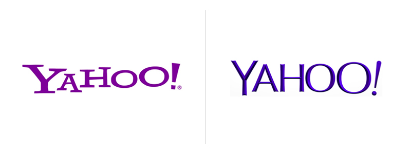
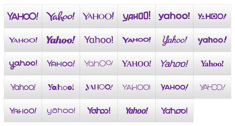
The weirdest thing to me about the new Yahoo logo is that there were actually 30 new Yahoo logos. As a PR gimmick, Yahoo revealed a new logo every day for 30 days to build anticipation for the final logo reveal. At the end of the 30 days, it seemed like a lot of hype for little payoff. The new, final logo is arguably the one with the least personality.
The second weirdest thing about the new Yahoo logo is that it was designed by their non-designer CEO, Marissa Mayer, with the help of Yahoo’s in house design team. On the subject of her role in the redesign, Mayer said on her blog, “I love brands, logos, color, design, and, most of all, Adobe Illustrator. I think it’s one of the most incredible software packages ever made. I’m not a pro, but I know enough to be dangerous :) … So, one weekend this summer, I rolled up my sleeves and dove into the trenches with our logo design team… We spent the majority of Saturday and Sunday designing the logo from start to finish…”
I’m not going to comment on whether or not Marissa Mayer is “dangerous” when it comes to Adobe Illustrator, but I don’t really think it’s smart to reveal that you spent one weekend working on the new logo. Aside from the weirdness of the 30 day rollout and the CEO being the designer, it’s not a terrible logo. It has undoubtedly lost some of the personality and spunk of the previous iteration, but the new logo feels more modern and, above all else, unoffensive. I can’t say it’s much of an improvement for Yahoo, but it isn’t a step backwards either.
We could all give a bit more credit where credit is due.
Everyone is entitled to their opinion, but I think that designers (and people outside of the industry) could be more constructive with their criticisms. There are certainly some laughs to be had when a logo is truly ridiculous (there are some wonderfully bad logos here), but it seems that more often than not, people mock new logos for the sake of jumping on the bandwagon. Maybe if we collectively make an effort to try to judge branding efforts with an unbiased, honest approach, we’ll have a few less trolls on our hands.
