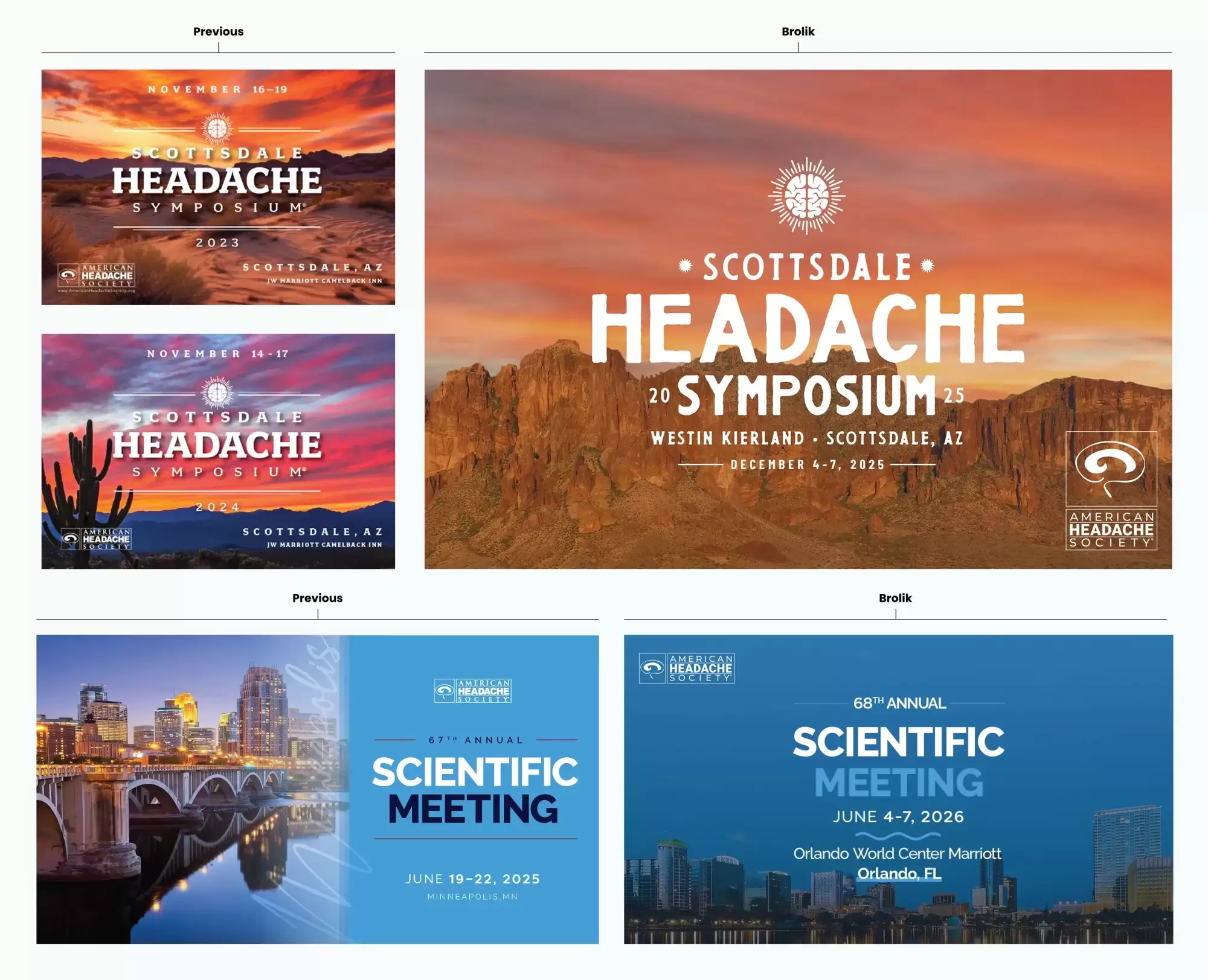
Balancing Consistency and Annual Updates
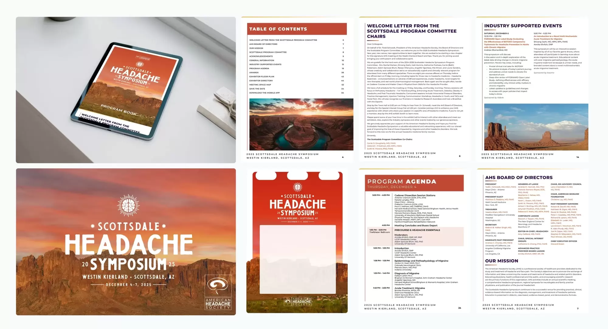
Each event has its own personality, but they're clearly part of the same family. The Scottsdale Symposium leans into its desert setting with warm sunset colors and Southwestern imagery, so it has a consistent vibe year after year while still feeling like its own unique event.
The Annual Scientific Meeting takes a different approach. We use a color palette of cooler blues that feel scientific, and play off that to bring in elements of the host city. Since the location changes annually, the goal is to weave in local flavor without losing that recognizable look.
See how we built on their previous designs, preserving each event’s unique personality while elevating the overall quality and clarity of the branding:
Creating a Complete Experience
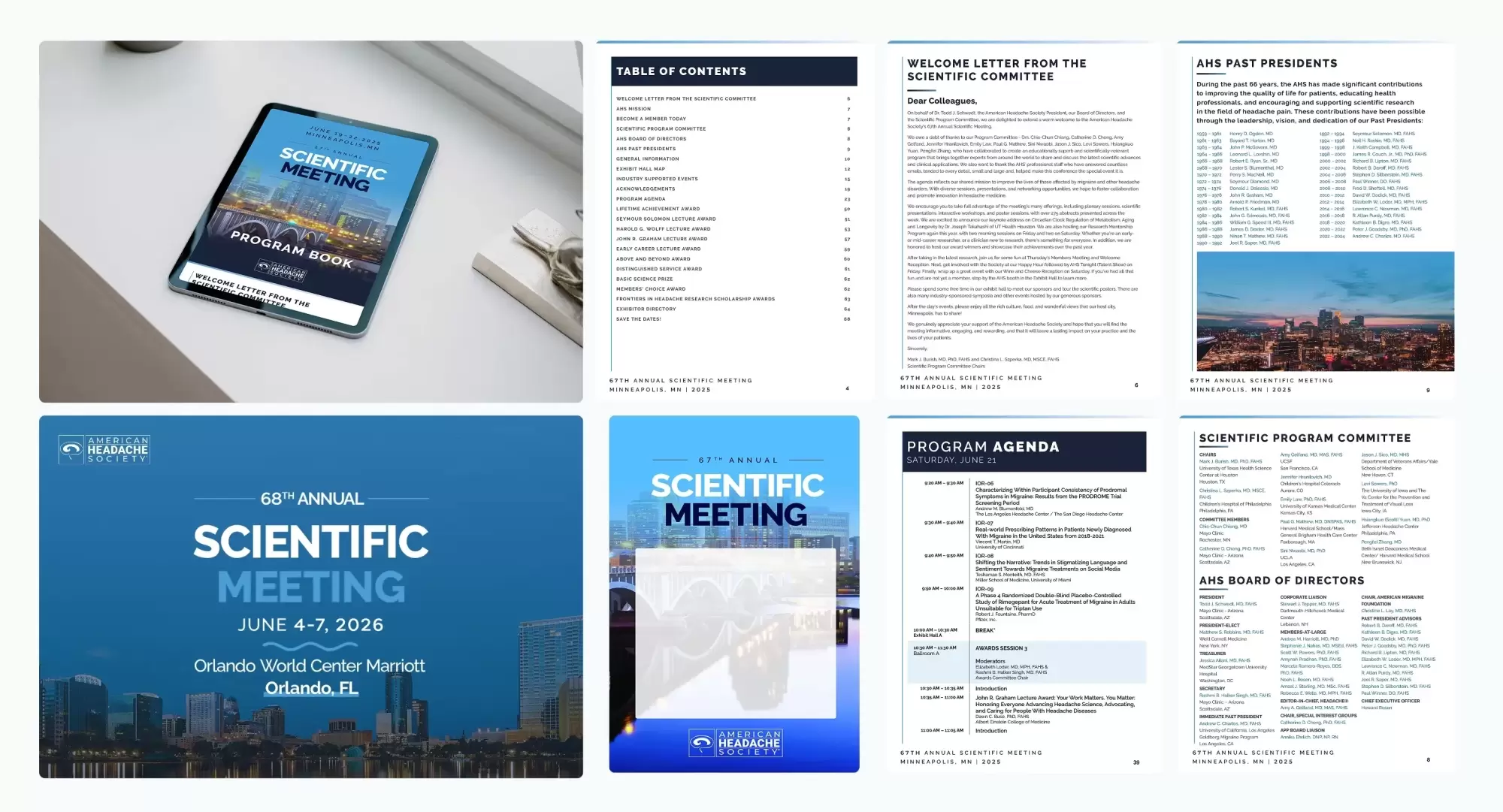
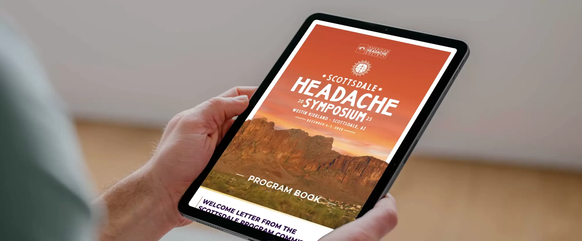
The branding shows up everywhere people interact with the event. The program book is the primary piece, but the identity carries through to badges, magnets, web graphics, email headers, and more. By keeping the visual system consistent across everything before, during and after the event, we create and maintain a cohesive experience during each meeting and over the years as the association expands.
Driving Long-Term Impact
Thoughtful, consistent event branding does more than just look nice — it builds long-term brand recognition for each cornerstone event and supports AHS’ mission. These meetings are crucial for professional development, building community, and advancing headache research. By developing visual identities that are both recognizable and evolving, we help AHS maintain a strong presence in the field and amplify the impact of their efforts.