
Michael Egan
CEO
“Great team to work with and a fantastic finished product.”
Exploring Directions
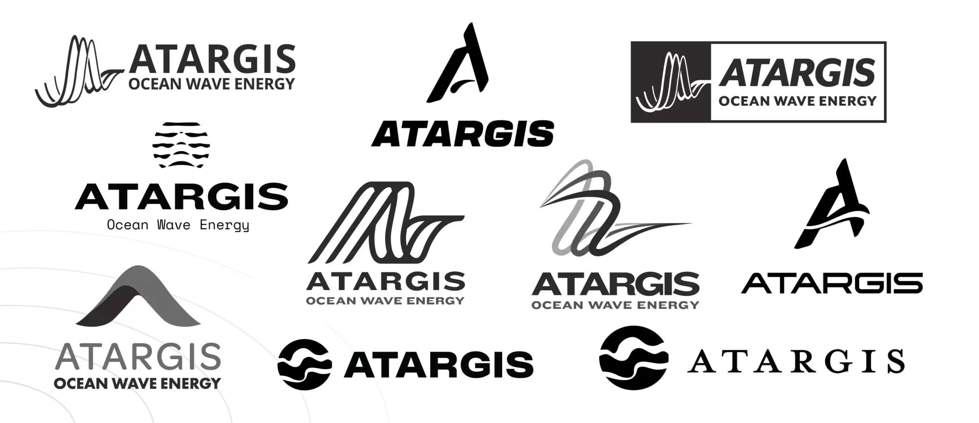
We started with broad visual exploration in Round A, testing different ways to express wave and ocean energy without being overly literal or technical. Concepts ranged from abstract wave forms to typographic treatments and motion-inspired shapes, focusing on tone and feel to guide direction.
Refinement Through Feedback
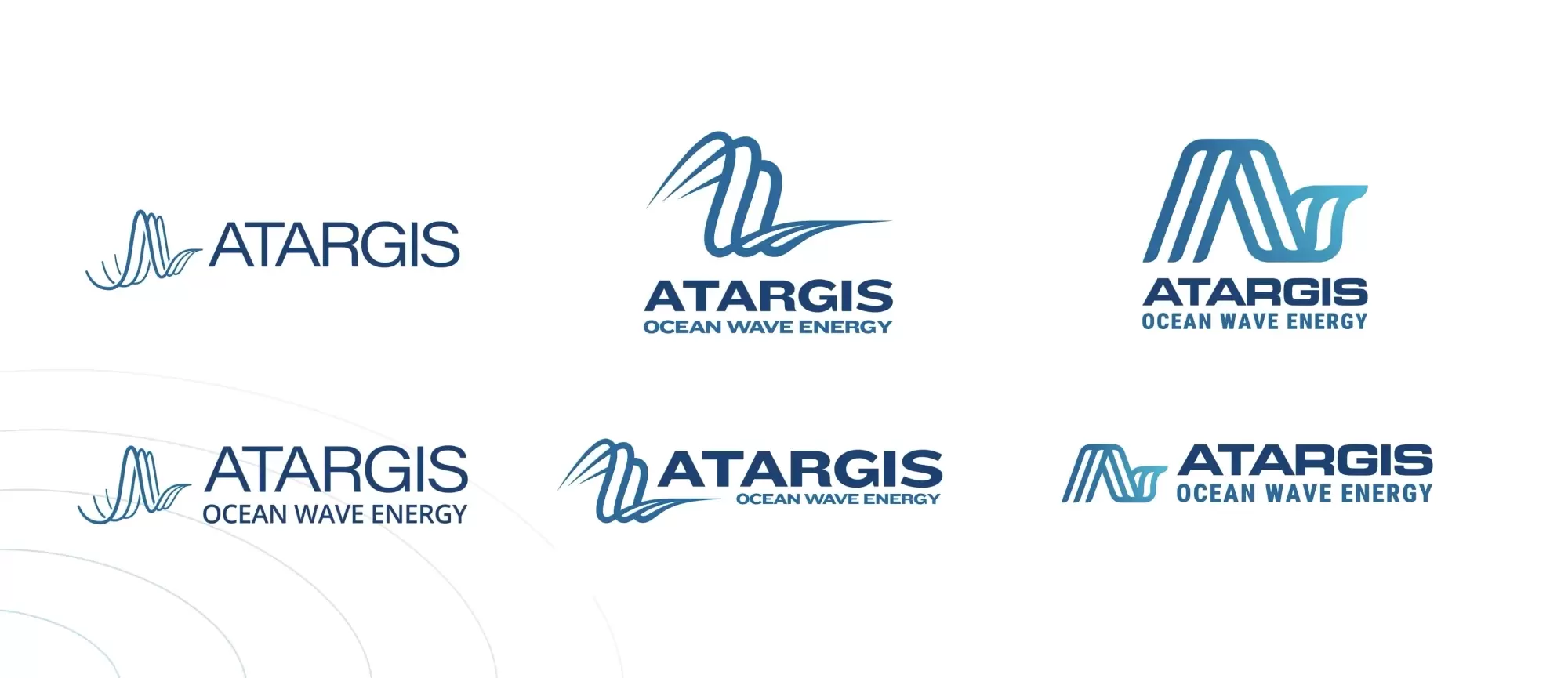
Round B refined a smaller set of concepts based on client feedback, improving balance, line work, and symbolism while addressing legibility concerns. We pressure-tested each direction across real-world applications to ensure the mark felt intentional, credible, and scalable.
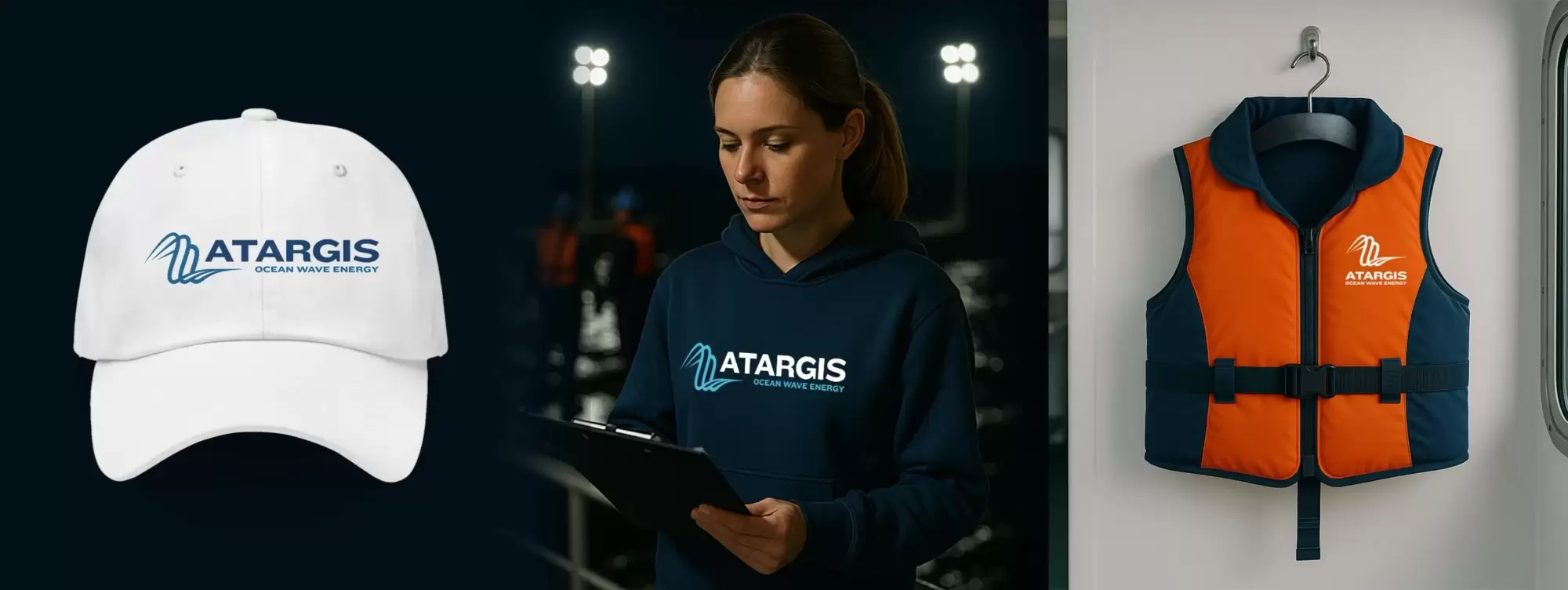
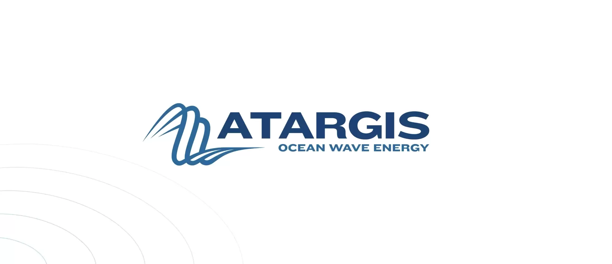
A Brand System Built for Real-World Use
The final deliverables included a refined brand mark, color palette, typography, and example applications showing how the identity would flex across marketing materials, presentations, and digital platforms. This visual system became the foundation for the Atargis website and future communications. See how the brand was applied on the website.